Role Experience Design Principal
Client KIA
UX Research.

How might we create a more cohesive and user-friendly design for the KIA cars?
Fixing fundamental design problems
🚘 Challenge
Kia’s internal teams had developed a design that, while creative, fell short in user engagement and satisfaction. The design, as it stood, posed several risks that could negatively impact the user experience and, by extension, business outcomes. Recognising these issues a regional leadership wanted to conduct a thorough review, with a focus on research and testing to identify and address the underlying problems before it effected their business performance.
🚘 Research approach
To ensure that the UX would meet both user and business needs, I embarked on a research-driven evaluation that included:
Stakeholder interviews I conducting in-depth interviews with key stakeholders, including product managers, designers, and developers. These discussions helped me frame the original intent behind the design decisions, the challenges faced, and the business objectives the design was meant to support.
User research I created interactive prototypes of the proposed design, which allowed for testing of the design without the need for full development. I conducted testing sessions with real users, using specific scenarios to observe their decisions, and reactions to the stimulus.After completing the testing sessions, I follow-up with open discussions to grant some deeper insights into their car buying experiences, these conversations were essential in understanding the nuances of their experience with the stimulus.
I went on to perform a systematic evaluation of the design. This allowed me to pinpoint usability issues, such as confusing navigation, inconsistent design elements, and areas where the design did not adhere to best practices. When problems were identified I used a number of tools to further validate these finding such as tree jack, first-click, heat mapping etc.
🚘 Findings
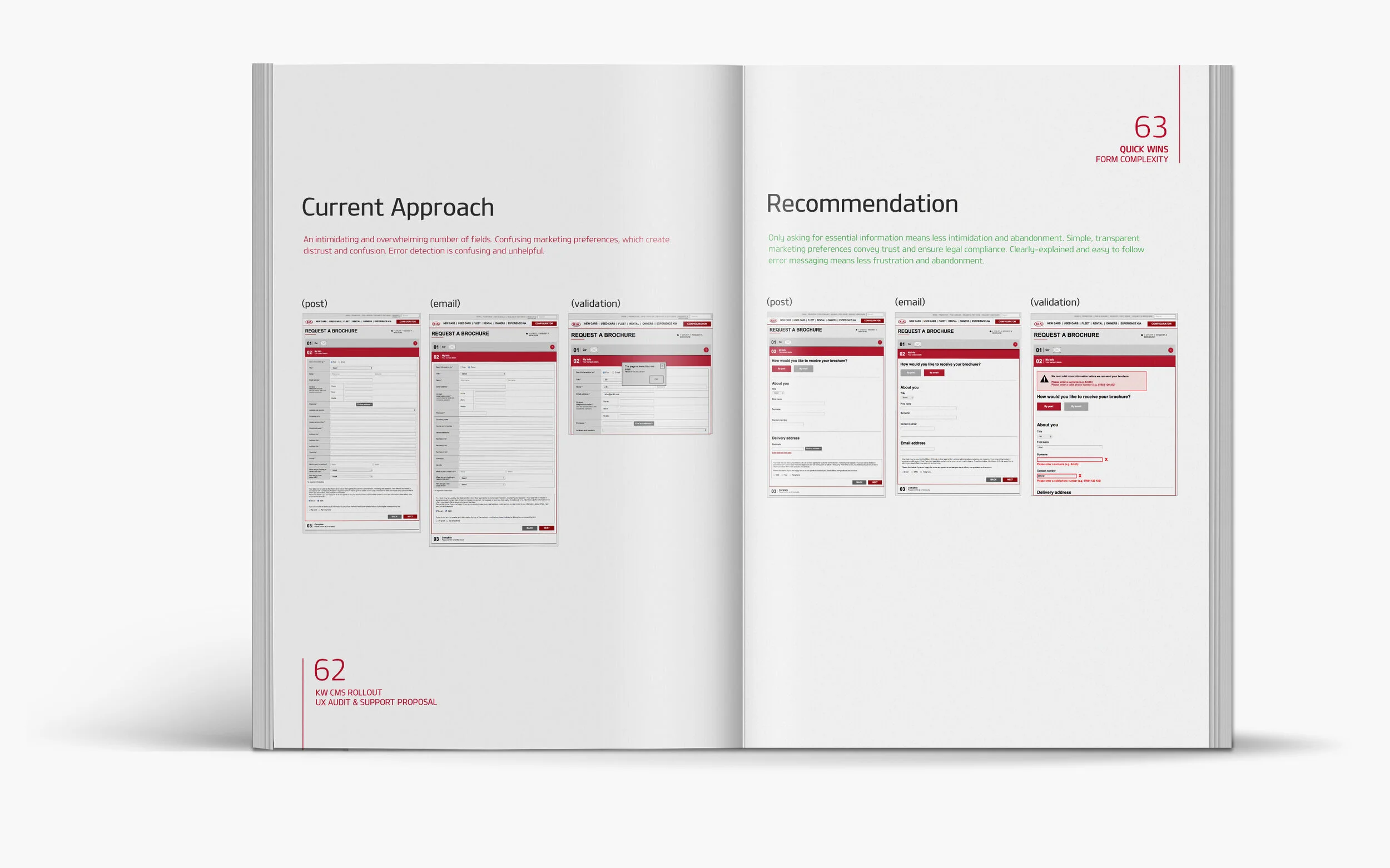
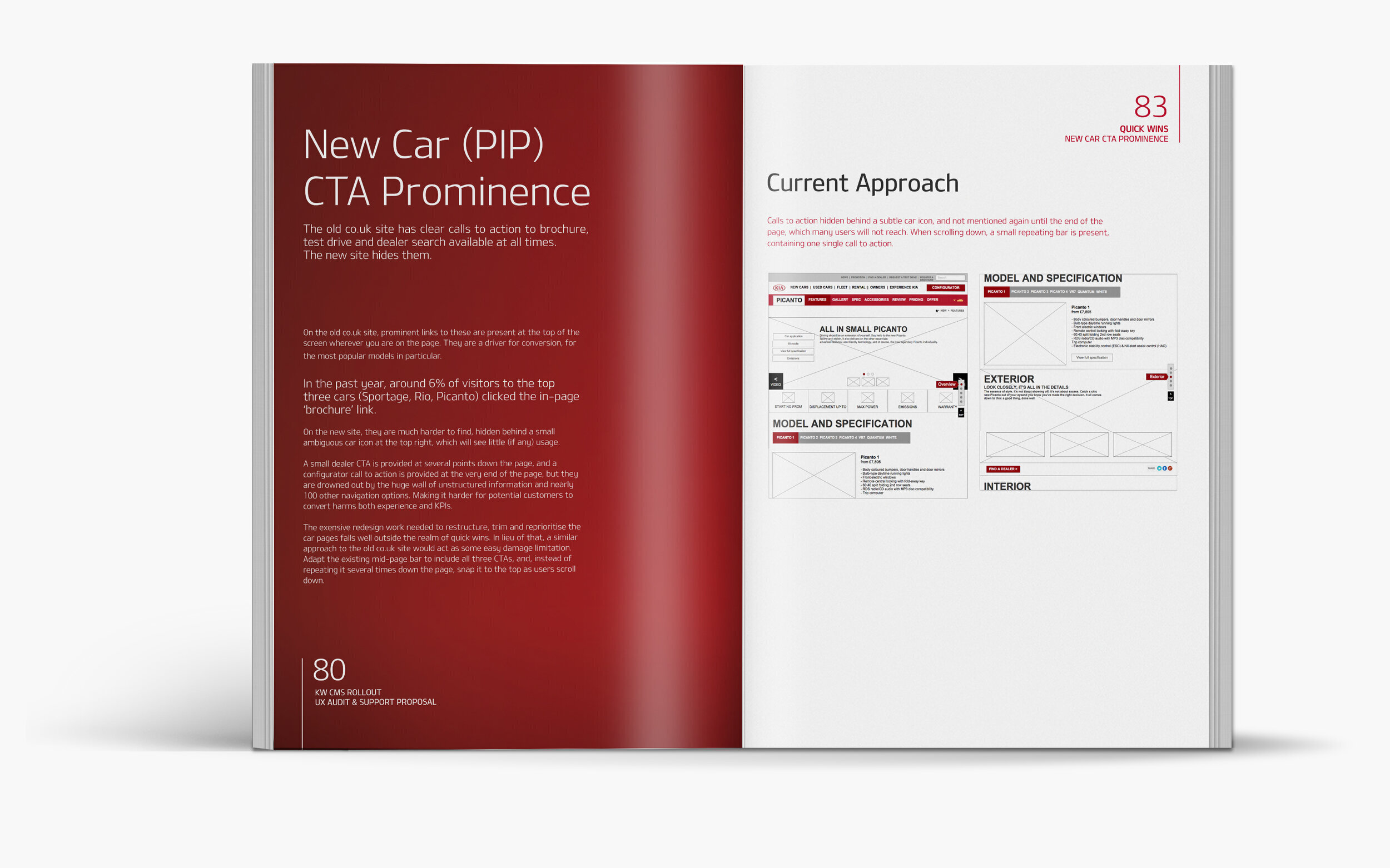
The new design exposed a broad range of issues, many of which persisted from the previous version. Rather than addressing these problems, the redesign unfortunately exacerbated them. There was widespread inconsistency throughout the design, particularly in templates, navigation systems, UI behaviour, and terminology. In some cases, multiple navigation solutions coexisted on the same page, creating a confusing and cluttered experience. For instance, the new car information pages (PIP) featured over 100 navigational routes for a single feature page, leading to excessive navigational complexity.
Unsurprisingly, test subjects found the navigation structure overwhelming, resulting in early task abandonment. This issue stemmed from a navigational taxonomy that was often ambiguous and incorrect. The necessity of stacking navigation five levels deep on some pages highlighted the flawed architecture. More often than not, users quickly became disoriented and overwhelmed, as the site did not allow them to develop a clear and simple mental model of its structure.
The poor architecture was further compounded by inconsistent elements and cluttered with content that held little value for customers and would be better suited for an internal intranet. Many of these issues were exemplified in the PIP pages, which are among the most popular on the site and serve as the primary means of showcasing the KIA product. The original concept for the new PIP template was a single page that guided the customer through a narrative from top to bottom. However, this approach did not align with how users interacted with the content. While some customers read thoroughly, the majority did not, instead opting to scan the page. As a result, the narrative-driven design approach negatively impacted usability. Moreover, the single-page concept itself was compromised in later design iterations with the addition of more navigational options, further detracting from the original intent.
Finally, the design failed to meet accessibility standards, potentially excluding a significant segment of users, particularly those with disabilities. Addressing these accessibility gaps was essential to ensure the design was inclusive and met the needs of all.
🚘 Solutions
To address the issues uncovered in the new design, a comprehensive approach was undertaken to develop new options and design solutions aimed at remedying the problems. Each identified issue was systematically addressed through a combination of design revisions, prototyping, and rigorous user testing to ensure the effectiveness of the proposed solutions.
Navigation The navigational complexity was tackled by simplifying the structure and reducing the number of routes on page. A clear and more logical hierarchy was established, ensuring that users could build a simple and intuitive mental model of the site. Prototypes of the redesigned navigation were tested, leading to a significant reduction in confusion and task abandonment.
Consistency The inconsistencies across templates, UI behavior, and terminology were addressed by outlines and a rationalised approach outlined. This would create a cohesive and consistent experience that reinforced the brand identity. Prototypes incorporating standardised elements were tested and the feedback confirmed a marked improvement in usability and recognition.
Content Content that provided little value to customers was identified and recommendations for relocating to or deleting was made. This decluttering ensured only relevant and useful information was prominently displayed, enhancing the overall user experience.
PIP Recommendations were made to accommodate both thorough readers and scanners by introducing more flexible content sections page anchors improved navigation options that aligned with user behavior. These changes were prototyped and tested, resulting in positive feedback with subjects finding the new design more intuitive and easier to navigate.
Initially, the internal design team was not best pleased with the fact that their new design had been subjected to testing and scrutiny externally. However, after reviewing the report and seeing the clear evidence of the issues and the positive impact of the proposed changes, they welcomed the feedback all.
🚘 Results
Based on the insights gained from research and testing, I provided Kia’s internal team with a set of actionable recommendations. These included restructuring the navigation, standardising design elements, improving accessibility, and refining user flows. The implementation of these changes resulted in a significantly improved UX, with higher user satisfaction and engagement. The research-driven approach ensured that the design was not only user-centric but also aligned with Kia’s business objectives, setting a strong foundation for future iterations.
⚡️Outputs
+ Improved user navigation
+ Enhanced content relevance
+ Redesigned PIP
⚡️Methods
+ User-centered design
+ Product design
+ Design research
+ Content design